Photo Challenges: October 2011
Photo Challenges:
October 2011
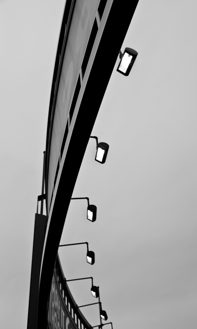
Monochrome
We’re taking away the color this month! Monochrome photographs have a single hue, rather than capturing the full color of your subject. This creates a more interpretive, and less realistic rendition.
How do you know which images will work best as monochromes? Photographs that rely on tonal contrast and variance, rather than on color contrast, to reveal forms, lines and textures are the ones that will work best as monochromes. If the story of the image can be expressed through its tones, try it as a monochrome. It may be that the color distracts from the story more than it adds.
Your submitted image may be true black and white, or it may be toned with a single hue. I will also accept subtly split-toned images. This is where the highlights and shadows are each toned with a separate hue. Often the highlights will be rendered in a warm hue, and the shadows in a cool hue. Toning and split-toning can be done with post-processing software such as Adobe Lightroom.
Read the rules. One entry only each month per person, please!
Enter your super-amazing photos in our photo contests. The winning image will be featured on the Ultimate Photo Tips homepage for all of the following month.
See what other people are submitting, and vote for your favorite:
View other entries.
Life in Black and White

Dinner Plates
© Julie Waterhouse

At the Window
© Julie Waterhouse

Upturned Glass
© Julie Waterhouse

In the Parking Lot
© Julie Waterhouse

Guestroom Lamp
© Julie Waterhouse
***C2_invitation_26855093***