Are you guilty of trying to stuff too much stuff into your photo composition? It’s a classic mistake. We want to share our experience with our photos. The trick is, you don’t have to share it all at once! Watch this week’s video to learn the benefits of simplifying.

Spread the joy! Share today’s tweetable!
Video Transcript
Are you looking for ways to take your photos to the next level? The biggest problem I see when I review photos from novice photographers is that they include too much stuff! Hi, I’m Julie from Ultimate Photo Tips, and today I want to talk about one of my favorite topics, and that is story-telling through photo composition. Specifically, I want to emphasize that less is more when you’re trying to tell a story through a picture.
All too often, I see pictures from a photographer who has come across a beautiful or unusual scene, and has proceeded to try to include all of it in one image. That’s the temptation, right? We want people to share our experience, so we try to "fit it all in" one image. Unfortunately, that photo composition strategy tends to backfire. The picture ends up looking chaotic, and viewer is left struggling to figure out what your intended subject really was.
Don’t make your viewer work hard. As the photographer, it’s your job to do the work! You have to simplify the scene in front of you by selecting what goes in your frame and what stays out. I firmly believe that if something doesn’t add to your story, then it actually takes away, and serves as a distraction. I encourage you to think carefully about what has attracted you to a particular scene, and then simplify, simplify, simplify, to leave only elements that tell that particular story.
Let’s look at a few photo composition examples from a trip I took to Istanbul.
© Julie Waterhouse
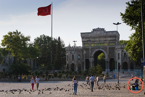
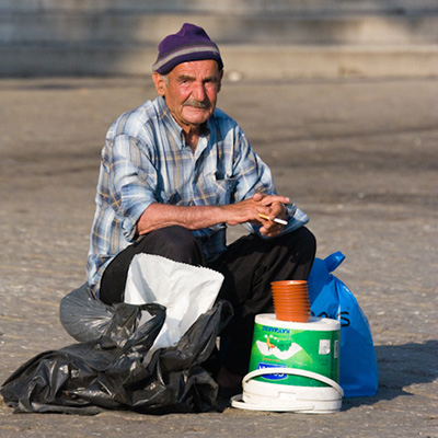
This first shot is really a tourist’s snapshot. There’s no compelling story, just an eye-level perspective of an open square and building. Can I find and isolate anything within this that would make a stronger story? What about this guy here who is selling bird seed to the tourists to feed the pigeons?
©Julie Waterhouse
Here’s a photo of just him. You don’t have to work as hard here to understand the story.

©Julie Waterhouse
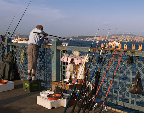
Here’s another one. Is this a photo of the mosque? The bridge? The people fishing? It’s hard to tell. There’s a lot going on, and the elements are not well organized. I was actually interested in the people fishing, so I walked forward a few feet and turned back to photograph this scene.
©Julie Waterhouse
I love the story here! It’s all about being too short! The gentleman’s pants are too short, and he’s too short! I’ve included his rods and tackle to tell the full story of what he’s doing, but it’s a much more coherent image than the first.
©Julie Waterhouse
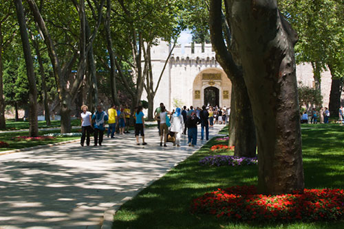
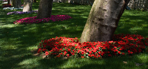
Finally, this photo composition of a path is not too special. But when I stopped to ask myself what was really catching my eye here, I found that it wasn’t the path at all.
©Julie Waterhouse
It was the row of trees with flowers at the base.
Take the time to understand what has caught your eye, and made you lift your camera, and then create a photo composition that eliminates everything from your image that doesn’t support that story.
That’s it for this time! For more tips to improve your photography, please visit ultimate-photo-tips.com, and make sure to sign up for my newsletter while you’re there! That’s where I share ideas and inspiration that I don’t share anywhere else.
Happy shooting, and I’ll see you next time!