Photography Rules of Composition: Visual Weight
Photography rules of composition: visual weight is the next one you need to have in your toolbox. It can make or break your photo!
Visual weight is a concept that describes how much something in an image “pulls” your eye to look at it. Imagine that you have an almost entirely white image with a small black dot in it. That black dot will pull your eye immediately; it carries a lot of visual weight.
As a photographer, you can use the photography rules of composition, and visual weight to your advantage. You can deliberately manipulate your subject in such a way that it carries a lot of visual weight, and thereby draws the viewer’s eye. On the other hand, if you are not aware of the concept of visual weight, you can inadvertently produce images with annoying distractions.
Balance
Tip
You don’t have to balance color with color, or light with dark. You can mix and match your visual weights! For example, a counter-weight to a large, bright area might be a small red object.
Many of the photography rules of composition relate to the idea of balance. Ideally, we want our images to be balanced. By "balanced," I mean that no single area of the image draws our eye so much that we get stuck there. Instead, our eye is free to roam around the image and take it all in. A balanced image feels pleasing to the eye, and not lop-sided in any way.
Another way of saying this is that an image is balanced as long as its visual weight is evenly distributed. Every element in your composition carries a certain amount of visual weight. To keep your image balanced, you must compensate for each element with a counter-weight. As you will learn in the following sections, different colors, different levels of contrast, and different subject positions all carry different visual weights.
In the photography compostion below, although the horses are small, they are both dark enough, and positioned close enough to the corner, to "weigh" as much as all of the light area of the image.
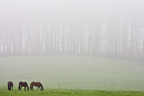
The placement of the horses right in the corner adds tension.
© Julie Waterhouse Photography
Let’s use our photography rules of composition, and look at each kind of visual weight in turn.
Contrast
Very light or very dark objects (light or dark in relation to their surroundings) draw our eyes. If you want to draw attention to a light colored subject, place it against a dark background. Conversely, place a dark subject against a light background to make it stand out.
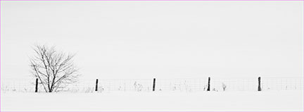
Photography rules of composition: visual weight – contrast
© Julie Waterhouse Photography
Be careful that you don’t have unintentional things in your picture that carry strong visual weight. These will take away from your main subject. For example, if the sun is reflecting off a shiny object in the background, it will take attention away from your subject. Likewise, if you have a dark spot that is unrelated to your subject, it will distract the eye. See the photography composition example below.
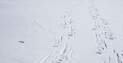
The black spot in the snow to the left of the tracks pulls your eye away.
© Julie Waterhouse Photography
Learn more in this section on eliminating distractions – another of the photography rules of composition.
Large expanses of white, or a bright color, in the image will draw your eye away from your subject as well. Your eye is first drawn to the brightest spot in the image.
What do you notice in the first photo below? You eye keeps going back to the sky in the top right. That’s not what’s interesting! But you can’t help it. The image is unbalanced, so your eye gets stuck on the sky.

The bright sky pulls your eye.
© Julie Waterhouse Photography
What about the second image? It’s exactly the same as the first one, except that I’ve cropped off the whole top. Now you’re looking where you should be, at the rock formations.

Now you can focus on what’s important.
© Julie Waterhouse Photography
Color
Specific colors draw our eyes too. Red and yellow easily attract attention. A spot of color amidst a neutral background also draws the eye. In the image below, I’ve used color to my advantage to draw your eye to the house. This image would not have the same impact at all in black and white.
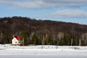
That red roof is small, but it commands a lot of attention.
© Julie Waterhouse Photography
That tiny spot of red carries a lot of visual weight. To my eye, it counter-balances the whole blue area of the sky. The small, red hot spot "weighs" about the same as the larger expanse of cool blue sky. Try to imagine the colors reversed with a blue roof and a red sky. The red would be overwhelming, and the image would be out of balance.
In the image below, color also plays an important role. In this case, however, it’s what causes the image to fail. It’s a nice idea to shoot the mountains with some vegetation in the foreground. Here, however, the bright yellow is too strong. It has so much visual weight that it completely overwhelms the image.

Both the brightness and color of the yellow flowers
overwhelm the image.
© Julie Waterhouse Photography
In the following image of the same mountain, I used different foreground vegetation. The color is more subdued, and the visual weight of the image is better balanced. The green grass and purple flowers "weigh" less than the yellow flowers above.

These more subtle flowers provide a balanced foreground.
© Julie Waterhouse Photography
Position
Where an object is in relation to the boundary, or frame of the image, impacts its visual weight. Objects that are close to the edge of the frame carry more visual weight. In other words, they draw our eye more. Again, you can use this to your advantage. If you place your subject according to another of the photography rules of composition, the photography rule of thirds, you will have a pleasing image. However, if you stretch that “off-center is better” rule, and place your subject even closer to the edge, you will produce more tension, and a greater sense of drama.
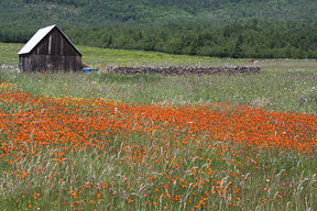
The scene is made more dramatic by placing the barn in the corner.
© Julie Waterhouse Photography
Because the barn is placed so close to the corner, it takes a lot of bright orange flowers to counter-balance its visual weight. If there were only green grass in front, the image would look unbalanced.
In the following photography composition, the flower has enough visual weight to balance all that rock, by virtue of both its color, and its position in the corner.
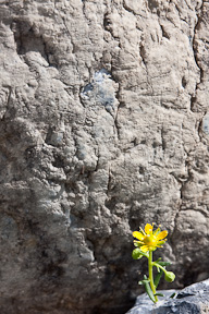
Rock versus flower!
© Julie Waterhouse Photography
That’s it for visual weight! Now I recommend you read the next of the photography rules of composition: major-minor.