Subject Placement:
Go Beyond the Rule of Thirds
Are you ready to go beyond the rule of thirds when placing your subject? Learn how the position of your subject relative to the frame relates to the story you want to tell with your photograph.

Spread the joy! Share today’s tweetable!
Video Transcript
Hello, it’s Julie here from Ultimate Photo Tips, and I’m back with another Two Minute Tip about subject placement. I’m not just going to give you the party line about the rule of thirds. Instead, I want to talk about how the placement of your subject relative to the edges of the frame relates to the story you want to tell. It all comes down to telling a story in the end, so we want all the choices we make when creating an image to support our story, and not distract from it.
Okay, so you’ve probably heard that it’s not a good idea to place your subject in the centre of the frame, because it makes the image too static. I say, "that depends." "Static" has some negative connotations. What if I replaced it with "stable?" Consider the following image:
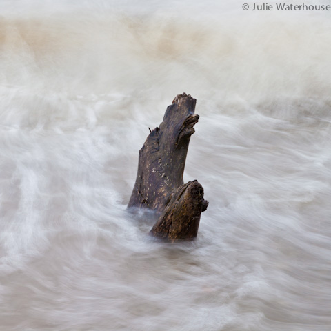
In this image, I’ve placed the subject dead centre. In this case, I think the image works. It works because my story is about that tree stump being solid and stable amidst the chaos of the rushing water. The subject placement echoes my theme.
Now let’s tackle that rule of thirds. It tells us to move our subject out of the centre, and into the thirds position, i.e., a third of the way in from the side, and a third of the way in from the top or bottom. That does make the image more dynamic, because it sets it off-balance. That can get the eye moving around more, which can be a good thing.
Now consider just how off-center you want to be. The thing is, the closer you place your subject to the edge of the frame, the more tension you create in the image. That’s because our brains are wired to give more attention to things at the edges. That holds double for placing your subject in a corner. Take a look at these next two photos.
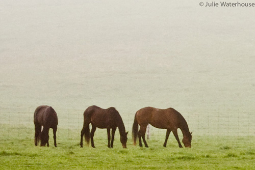
In this first photo (above), the three horses are in the bottom third of the image, and slightly to the left.
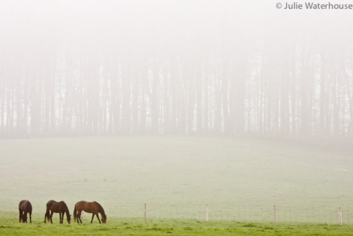
In this next image (above), I’ve moved the horses much closer to the bottom left corner. This creates more tension, and I think it works in this image to emphasize the vast, empty space around the horses.
It’s always good to be in control of your subject placement, and make deliberate decisions that support your message. You do want to be careful not to inadvertently place a subject too close to the edge, or just touching the edge, because it will created an uncomfortable and undesirable tension. Take a look at this final pair of photos.
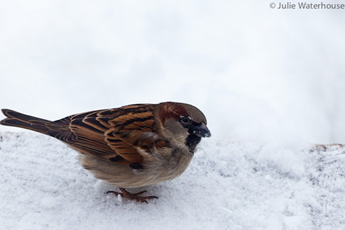
In this first image of a sparrow, the tail feathers are touching the frame, and slightly cut off at the left. This just makes you wish that they were all in, and the brain spends all its time and attention on those pesky tail feathers, instead of looking around the rest of the image.
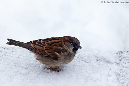
Much better to get the whole bird in the frame, and give that tail a little space.
The moral of the story is to be deliberate with your subject placement, and choose a position that emphasizes stability, or tension, according to the story you want to tell.
That’s it for this week! If you’re looking for more tips, drop by ultimate-photo-tips.com, and sign up for my free newsletter while you’re there. Happy shooting, and I’ll see you next time.