Photography rules of composition: the next one that you must understand is how to properly position your subject in the frame. You want to break the rules? Well, you need to master them first, so read on!
Positioning Moving Objects
Objects that can move, like people, animals, or cars, should be given room in the picture space to move into. If you put your frame boundary right in front of a moving object, it either looks like it’s going to “hit a wall,” or that it’s moving right out of the picture.
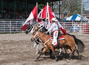
The horses have somewhere to move into.
© Julie Waterhouse Photography
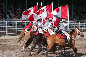
The horses have unnecessary room behind them,
but nowhere to go but out of the frame.
© Julie Waterhouse Photography
Leave space in the picture frame “open” in front of a moving object. The fast the object appears to be moving, the more space it can handle in front of it. The view imagines that the subject continues to move, and visualizes it moving through the picture space.
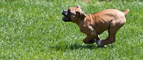
Lots of room to run.
© Peter Ainley
Positioning Heads
Avoid having a line pass “through” someone’s head in your photograph. It is very distracting.

The back of a couch creates a line through the baby’s head.
© Peter Ainley

Change your shooting angle to get rid of the line.
© Peter Ainley
Move around and change your shooting angle so that what is behind your subject is as neutral as possible. Try to get down and shoot at the level of your subject, too.
|
|
Pointing
If you have an element in your photography composition that “points” (it doesn’t have to be a person, it could be an inanimate object like a tree branch, too), then it’s a good idea to keep it pointing into the picture space, and not out of it. The viewer’s eye will tend to follow the direction of the lines in your image, so you don’t want to point them right out of your picture!
I recommend you read the next of the photography rules of composition: visual weight.
